Curating Digital Spaces: A User-Centric Approach to Streamlining ICI’s Website
2023My Role: UX Consultant
Tools Used: Figma, Google Sheet, Google Slides, Google Form
Tools Used: Figma, Google Sheet, Google Slides, Google Form
Field > User Research, Usability Testing, UX Consulting
🌐 Project Context
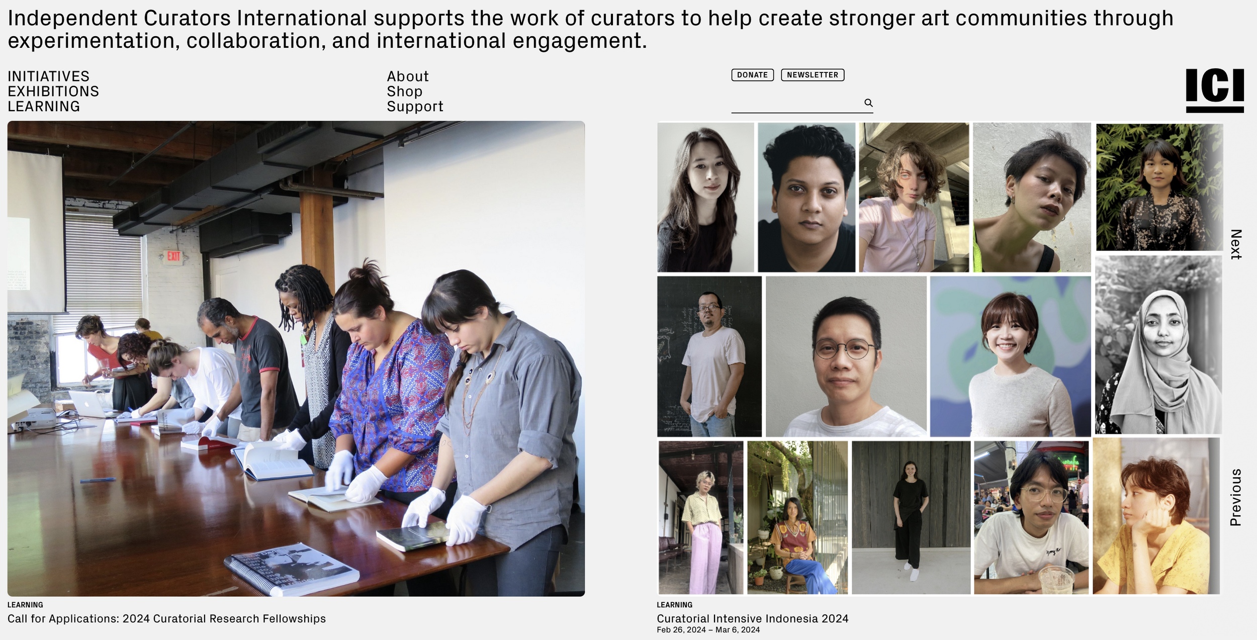
Independent Curators International (ICI), a New York-based non-profit, connects curators, artists, and audiences globally. ICI wanted to enhance its website’s efficiency and accessibility, aiming to make it more intuitive for its users. Our goal: is to identify problem areas and improve user experience through in-depth usability testing.
My Role

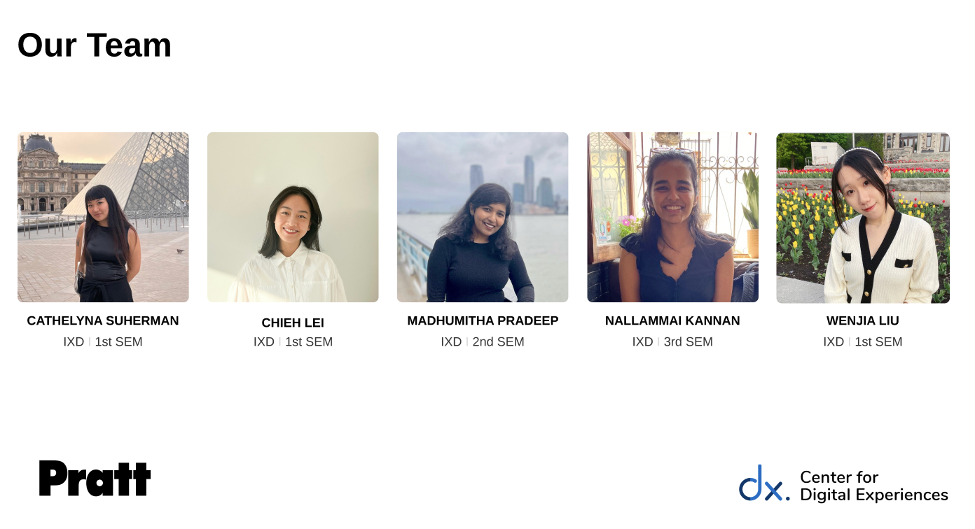
I worked in a team of five graduate students from the School of Information at Pratt Institute: Saskia Suherman, Wenjia Liu, Chieh Lei , Nallamai Kannan and Madhumita Pradeep. Together, we conducted research, designed user tests, and analyzed results. My role was to create scenarios, lead user testing, and collaborate on the final recommendations.
The Challenge 🚩

ICI’s website had recently undergone a rebranding but lacked a clear understanding of its user experience. Despite analytics tools, ICI struggled to understand how well its website worked for its audience, which includes:
- Alumni
- Aspiring Curators
- Museums & Galleries
- Art Enthusiasts
- Educational Organizations
Their goals included:
- Evaluating content effectiveness.
- Understanding user navigation.
- Enhancing the site’s accessibility.
Designing the User Test 📝
To explore user experience, we created tasks simulating common user journeys, such as finding professional development programs or learning about past curators. The tasks focused on navigation, program information, and exhibition exploration.
- Scenario: Users were asked to browse programs, learn about curators, and find exhibition details within 20 minutes.
- Participants: We recruited users familiar with ICI, aiming to ensure they could provide valuable feedback.
Recruiting Users 📧
To find the right participants, we collaborated with ICI’s head of communications, Taylor Black. Users were contacted through newsletters and social media channels. While some users didn’t complete the tests, we managed to recruit others directly through personal outreach, ensuring familiarity with ICI.
We utilized Google Survey for Taylor to circulate in their email newsletter, as Chieh and Wenjia exchanged emails with Taylor. While they were doing this, Nallamai and I worked on emailing each one of the users that were successfully screened. We used Calendly to schedule a testing time.
User Testing
We conducted six moderated user tests with participants who were familiar with ICI, curating, fine arts, and exhibitions. Each test, lasting around 20 minutes, was run remotely via Zoom and Google Meet, allowing us to reach a broader pool of users.
Each session had two team members present—one facilitating and the other taking notes. After the tests, participants filled out a post-test questionnaire to share their overall experience. This approach ensured that our recommendations were aligned with real user insights.
Key Findings 🔍
Through 6 remote, moderated tests, we identified major issues in the site's design:
Confusing Navigation 🌀
-
Participants found inconsistent jargon in the menu, making navigation unclear.
-
Users struggled to locate specific sections due to a lack of headings and visual guidance.
Unclear Exhibition Information 📅
- No clear separation of past, current, and upcoming exhibitions, leading to user confusion.
No Hover Feedback ❌
- Links and images lacked interactive hover states, reducing clarity about clickable elements.
Dense Text Blocks 📚
- Large chunks of text made it hard to digest information quickly, especially on program pages.
Missing Call to Action 📢
-
Limited guidance for users interested in applying to programs, with no clear application tracking.
Recommendations 💡
Based on user feedback, we proposed five major changes:Finding 1: Confusing Navigation Bar
- Jargon and inconsistencies in the fonts
- Lack of negative space
- No hover feedback for logo hyperlinks
- Lack of distinction between sections
Finding 2: Unclear Exhibition Information
- Unclear classification of past and current exhibitions
Finding 3: Lack of Feedback with hyperlinks
- Image hover links lacked hover state
Finding 4: No Hierarchy in Text
- Lack of headings make the text wordy
- No separation of information in text
Finding 5: No Call to Action for Programs
- Unclear call to action for programs
- No application platform for applicants
Recommendation 1: Redesigning navigation bar and top description
This meant re-arranging where things are. For example, users mentioned that the logo lacked a hover state that symbolized its hyperlink to the homepage and that it’s too far down on the right side. Rather, users preferred it on the traditional left top corner of the page. There was also confusion in the jargon of the navigation bar, especially the “learning” page. There was also confusion as to what was a hyperlink, because not only did it not have a hover state either, but some were in uppercase letters and the rest in lowercase. Thus, we added a hover state and changed the page titled “Learning” as “Programs”
Recommendation 2: Redesigning Exhibition Information
A lot of users were confused as to which exhibitions happened, which ones are presently happening, or which ones are going to happen; TLDR, a need to classify past, present and future exhibitions. Thus, the introduction of a filter on the top of the page, as well as an exhibition date under each thumbnail to make the burden less on users because then users won’t need to check the dates themselves.
Recommendation 3: Introducing a Hover State for Images
This was a surprising find in the website because although some (not all) of the hyperlinks did have an underline state when hovering, images did not at all have any hover state. Therefore, the team added a simple translucent overlay when users hover on an image. This interactive element is simple but very much appreciated because it definitely adds a more consistent and intuitive experience.
Recommendation 4: Incorporating Headings for Quick Content
Nothing is more stressful than a big chunk of text. During the testing, users encountered big chunks of paragraphs when navigating through the exhibition page. Although it might be informative, it’s found that users were overwhelmed with it. Thus, adding an “overview” and “details” heading is much needed to make the reading easier on the eye. The addition of adding a quick overview offers the information to be much easier to digest.
Recommendations 5: Call to Action for Open Applications
When trying to navigate through ICI’s learning programs, applicants to each program would need to constantly survey their applications. There is no distinction of past and future intensives, with past initiatives also not having any information and details of the application. Thus, adding a tracking page of the program application would be incredibly efficient for users to monitor which applications are currently open. This would reduce the burden and load of the user’s effort in identifying which programs are accepting applications.
Site Evaluation
With these findings and the respective recommendations, it’s clear that ICI’s website usability testing revealed aspects of improvements that would benefit both the user, as well as ICI. With accessibility in mind, we concluded that ICI’s website was confusing for novice users, especially those who are looking to apply to ICI’s professional development programs. Certain layouts needed refreshing, and certain design aspects also needed redesigning. For example, the layout of how the information is in the homepage, with the lack of hover states, as well as the use of a singular type of font (Regular px Grotesk) that albeit looks clean and minimalistic, lacks the hierarchical distinction between information.
Presentation and Takeaway
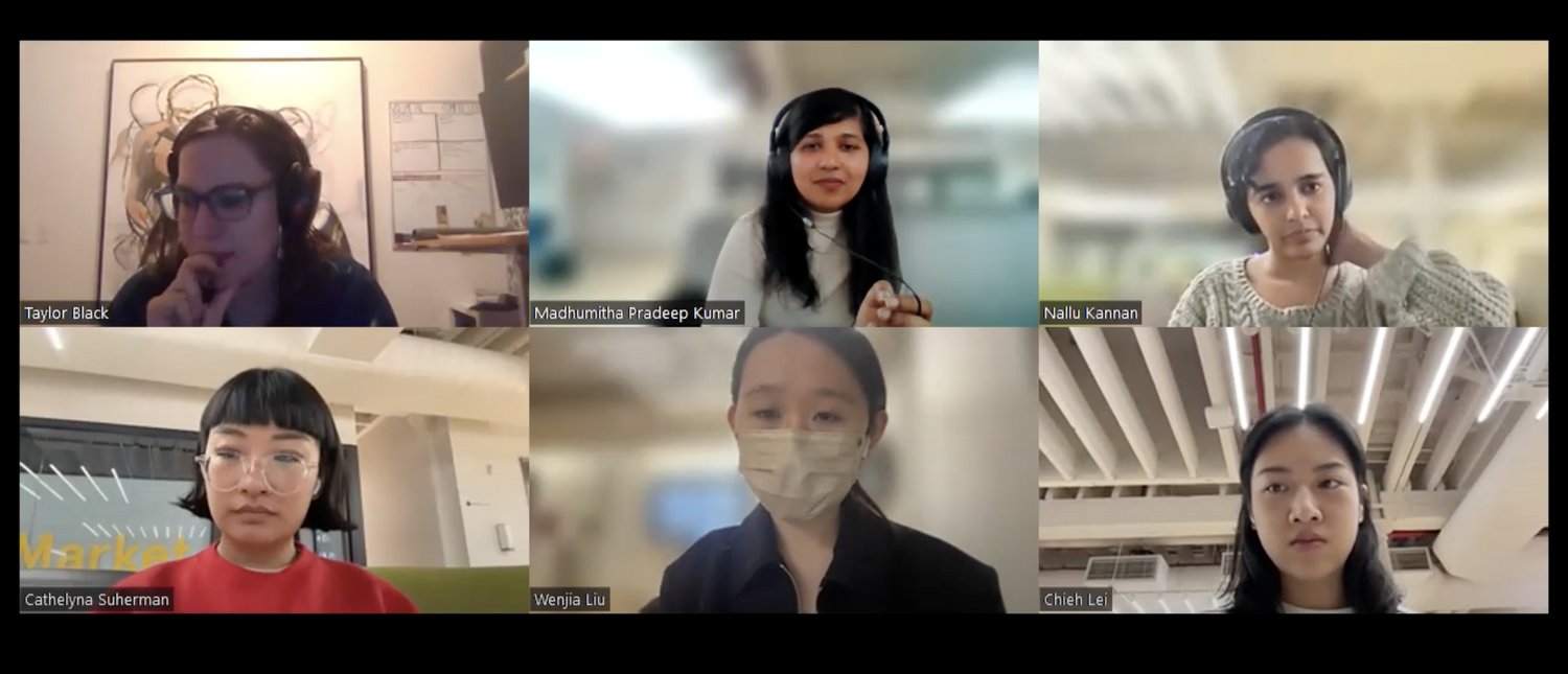
We finished with a full report and a presentation for the client, and we presented remotely through Zoom. We found out that the client were unaware of the the features found in findings themselves and was satisfied with the results we presented. Especially the home button feature, the client didn’t know that it was a hyperlink to the home page and was thankful that we found that out through our user testing. At the end, our recommendations came useful and exhaustive. I personally also though that it was insightful, although I wished that we had more time to work on it with a wider pool of participants and recommendations we could have reported on.
