Translating Heritage into Virtual Spaces: Designing the Brooklyn Seltzer Museum Virtual Tour
2024My Roles: Design Lead
Tools Used: Matterport, Figma
Brief
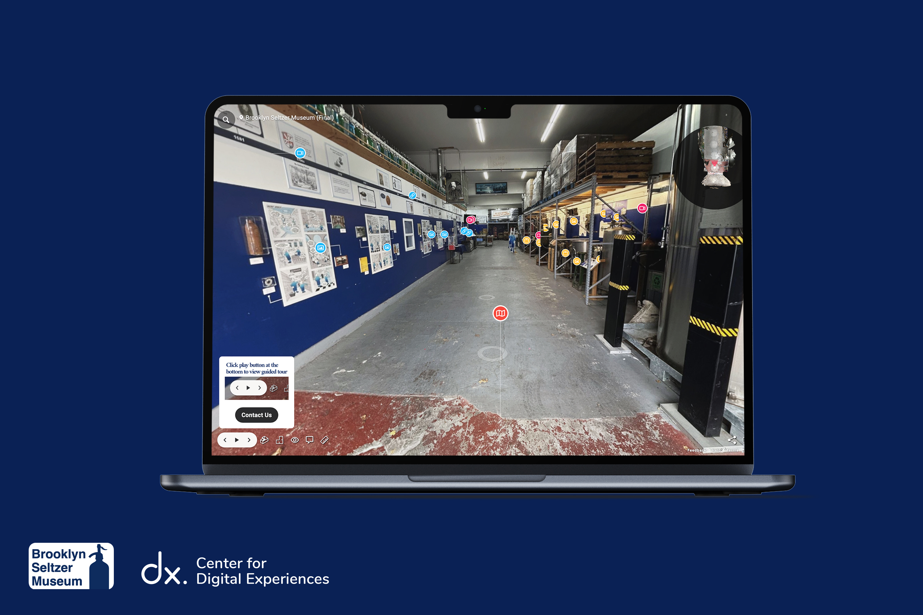
The Brooklyn Seltzer Museum is a Museum located inside the oldest seltzer works in New York City. It showcases the art and science of seltzer-making through the eyes of the Gomberg family’s multigenerational legacy. Our mission was to design a virtual tour that is able to tell the museum’s unique stories outside of the confines of its physical space.
Our mission was to bring the authentic seltzer-making experience online using Matterport, sharing its unique stories and history.
The challenge lay in curating engaging content that fits Matterport’s limits while appealing to casual viewers and enthusiasts
Team members: Saskia Suherman, Shrividya Shrihari and Qiaochu Zhao
Duration: August – December 2024 (4 months)
Duration: August – December 2024 (4 months)
Meet the Team
MATTERPORT
Understanding Matterport and its Constraints
We started by exploring Matterport’s capabilities and constraints. While Matterport offered powerful 3D scanning features, we encountered several challenges and constraints during planning and implementation.
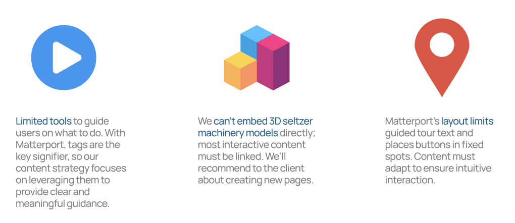
- It has limited tools to guide users on what to do. With Matterport, tags are the key signifier, so our content strategy focuses on leveraging them to provide clear and meaningful guidance.
- We can’t embed 3D seltzer machinery models directly; most interactive content must be linked. We’ll recommend to the client about creating new pages.
- Matterport’s layout limits guided tour text and places buttons in fixed spots. Content must adapt to ensure intuitive interaction.
Testing Matterport's Standpoints
Standpoints are the backbone of any Matterport virtual tour, serving as the key navigational and visual anchor points within the digital space. Each standpoint represents a position where the Matterport camera captures a 360-degree scan, allowing users to move through the environment seamlessly. For the Brooklyn Seltzer Museum, the placement of standpoints was a critical design decision, as it directly influenced the tour’s usability, flow, and engagement. With the foundational structure established, we began experimenting with the placement and usability of each standpoints within Matterport to ensure that users could navigate the tour intuitively, with smooth transitions between points.
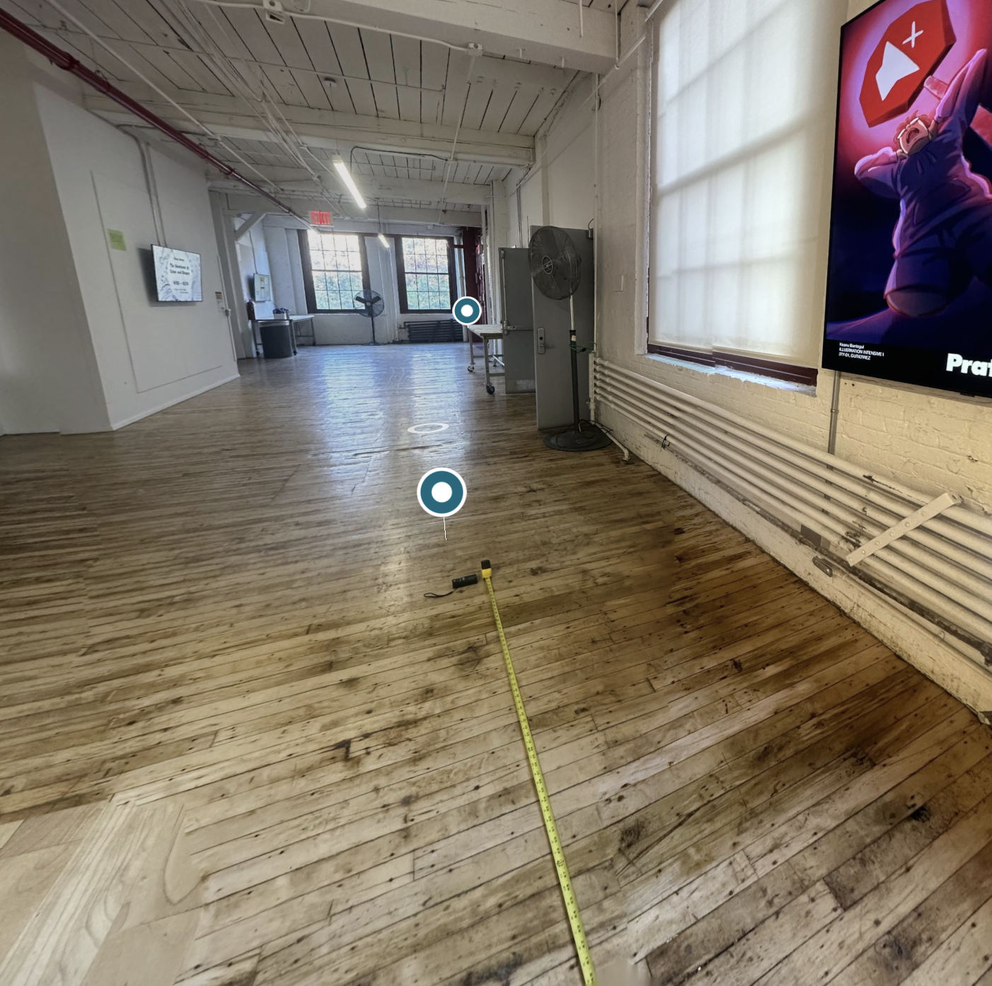
Different distance, Standpoint Test Experiment Conducted at the Pratt Institute Brooklyn Campus, 2024
Validate Navigation Flow: Ensure the placement of standpoints guides users naturally through the tour, minimizing confusion or the need for backtracking
Logical Transitions: Testing whether users could move naturally from one standpoint to the next without confusion.
Identify Overlaps and Blind Spots: Check for areas where tags or standpoints are overcrowded or where significant exhibits might be overlooked.
Matterport’s Recommended Guidelines for Scan Positioning.
Matterport suggests scan positions be spaced 5–8 feet (1.5 — 2.5 meters) apart and maintain a line-of-sight to the previous scan point. Additionally, the camera must remain at least 24 inches (60 cm) from walls and objects to avoid capturing distorted or incomplete images. To evaluate these guidelines, we conducted tests with scan positions spaced at 24, 16, and 8 feet apart. We tested this on the Pratt Brooklyn campus.
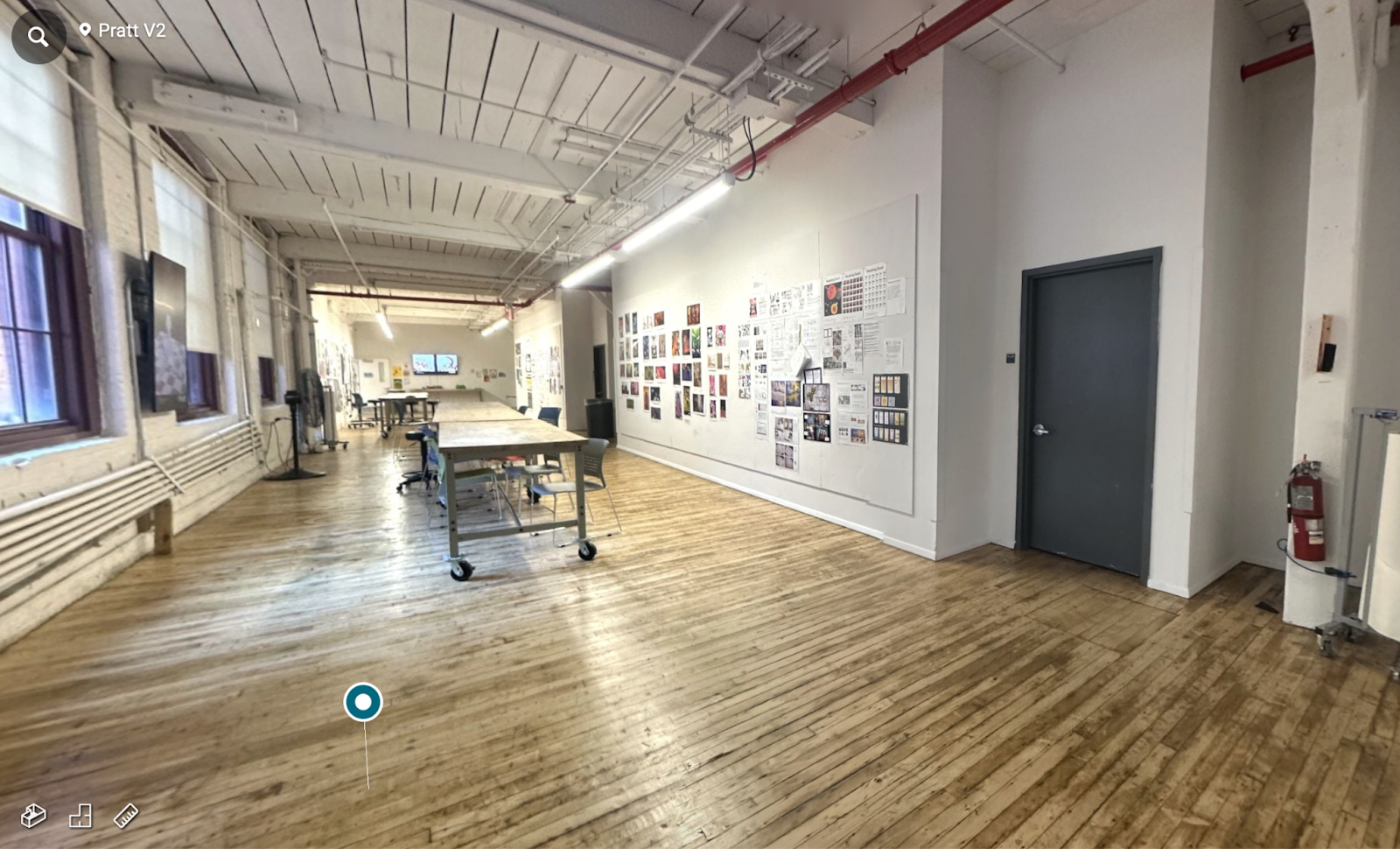
Overview of the Standpoint Test Experiment at the Pratt Institute Brooklyn Campus, 2024
Now with our Matterport Research complete, Our Objective is to Identify the Challenges surrounding their current Virtual Tour.
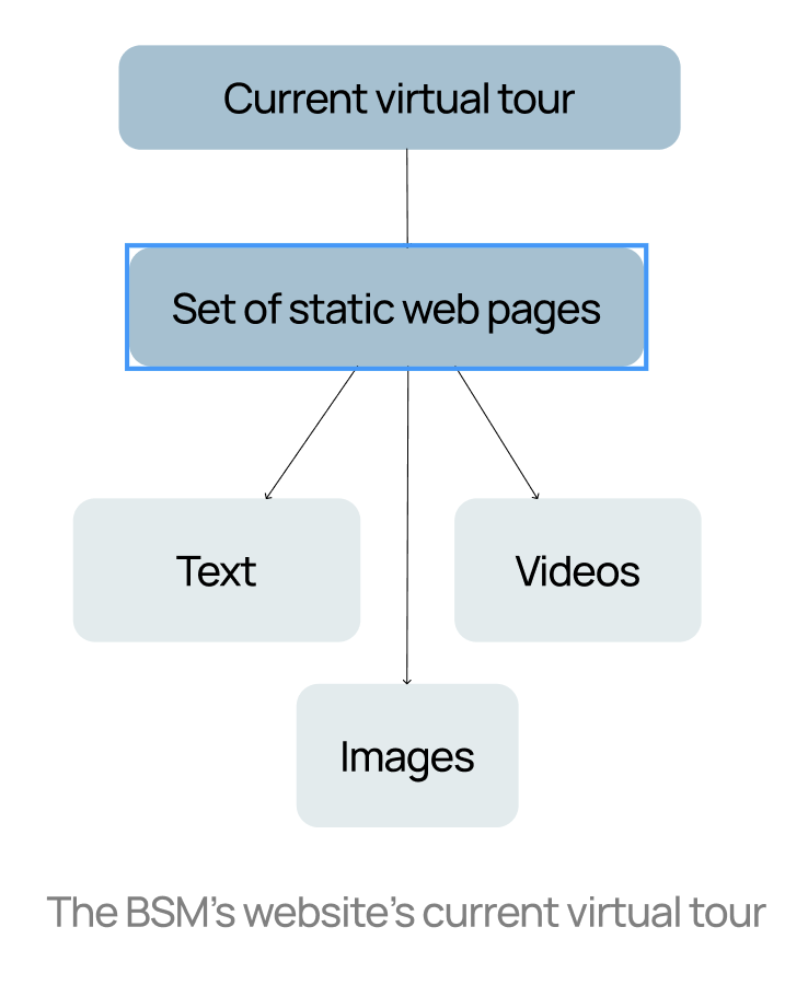
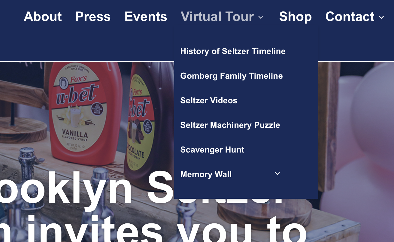
The current state of the tour is unintuitive and hard to follow, as it primarily relies on disconnected text, videos, and images. Without a cohesive narrative to tie these elements together, the experience feels fragmented and overwhelming, reducing its overall impact. Overall, the challenges are centered around these three primary challenges:
- Unstructured navigation systems: The current virtual tour lacks structure, with users relying on links to navigate between pages.
- Disjointed user flows in traditional tours: The virtual tour lacks the storytelling and Gomberg family’s history of the in-person experience
- Static environments: Static pages miss the walk-through feel and museum-factory uniqueness.
History Lives in the Details
When we first began working on the Brooklyn Seltzer Museum’s virtual tour, their dedication to preserving the heritage of the Gomberg family’s seltzer-making was immediately apparent. Every artifact, story, and bubble told a tale of tradition, community, and innovation. Although the museum itself is novel, its collection of items and stories remains a testament to their craftsmanship. The client was deeply committed to using Matterport as the platform for the virtual tour, valuing its ability to accurately capture the charm of their physical space and create an immersive user experience.
Matterport can create a virtual tour that balances historical depth with modern interactivity. Our strategy revolved around three core elements:
Our guiding strategy, 2024
- Audience: Who visits the museum and interacts online? Are they drawn by curiosity, education, or nostalgia for seltzer’s cultural heritage?
- Strategy: How can the Gomberg family’s history be shared in a way that feels engaging and immersive? Exploring the best methods to convey the legacy and cultural significance of seltzer through compelling narratives.
- Tactics: Which types of visuals most effectively capture attention and interest? Testing archival photos, videos, and animations to determine the most engaging ways to bring seltzer’s history to life.
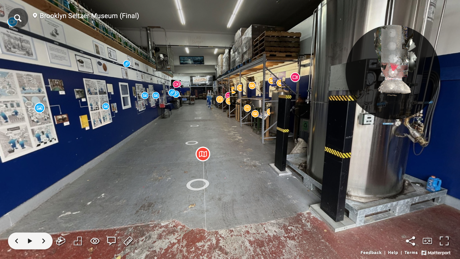
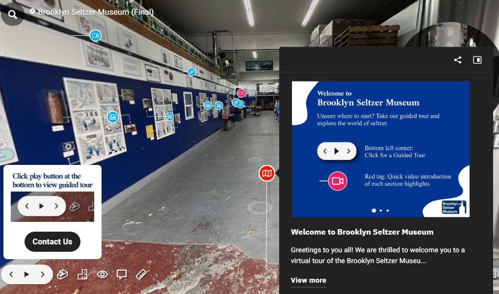
Final Screenshot of the Matterport Entrance Scene, 2024
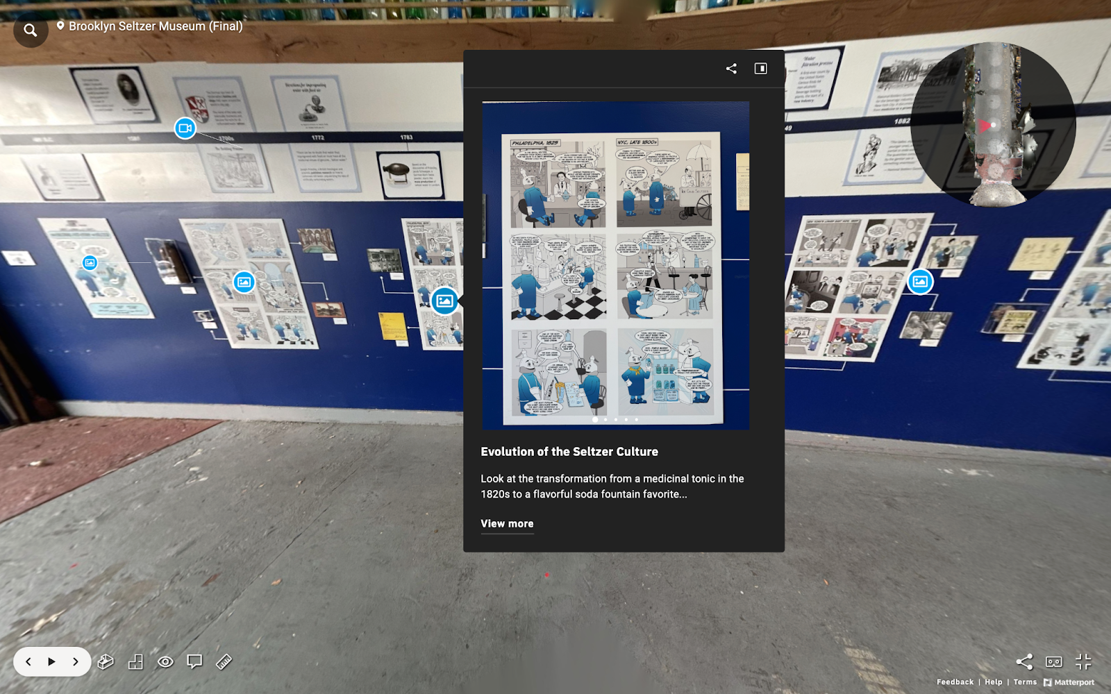
Final Screenshot of the Matterport Tags Interface, 2024
VIEW THE TOUR HERE
HOW WE STARTED – DESIGN QUESTION
How might we design a virtual museum tour that balances storytelling,
interactivity, and accessibility, while maintaining clarity and engagement
for users with varying levels of interest and knowledge?
Structuring the Virtual Narrative
With the audit and testing complete, we began developing a strategic map to plan the flow of the virtual tour. Unlike the in-person experience, where a guide narrates the journey in real time, creating a linear guided tour in Matterport required careful planning to replicate this sense of cohesion.
Our first step was to create a to-scale blueprint of the museum, which allowed us to visualize how users would navigate the space and where key storytelling moments could occur. This blueprint became the foundation for determining the placement of standpoints.
By spacing each standpoint 8 feet apart, we aimed to ensure smooth transitions between points while maintaining a seamless blend of storytelling and accessibility. These decisions were informed by earlier testing and served as the starting point for structuring the virtual experience.
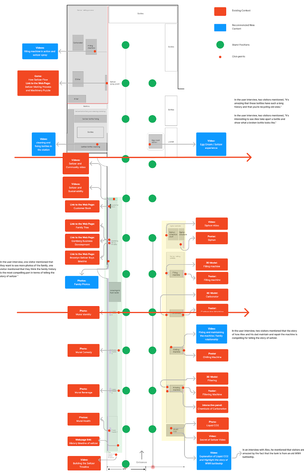
Annotated Initial Draft of the Map Illustration for the Brooklyn Seltzer Museum Standpoints and Recommended New Content, 2024
RESEARCH
Laying the Foundation: User Research and Insights
What strategies can transport a local museum’s vibrant personality into an online environment? Through interviews, surveys, and contextual inquiries, we unearthed key insights into user behaviors and preferences throughout the tour within the museum.
Research Goals:
- Discovering Motivations: What draws users to the museum? Is it because of curiosity, education, or its cultural significance?
- Navigation Optimization: What types of design pathways make the tour feel intuitive and enjoyable? Testing different layouts, transitions, and interaction prompts to create the most intuitive experience through the museum.
- Highlighting Exhibits: Which exhibits resonate to the users the most? Is it the vintage machineries or the personal stories? This includes figuring out the best format to present historical context, interactive exhibits and technical detail
To execute our solution, we decided to implement these three steps:
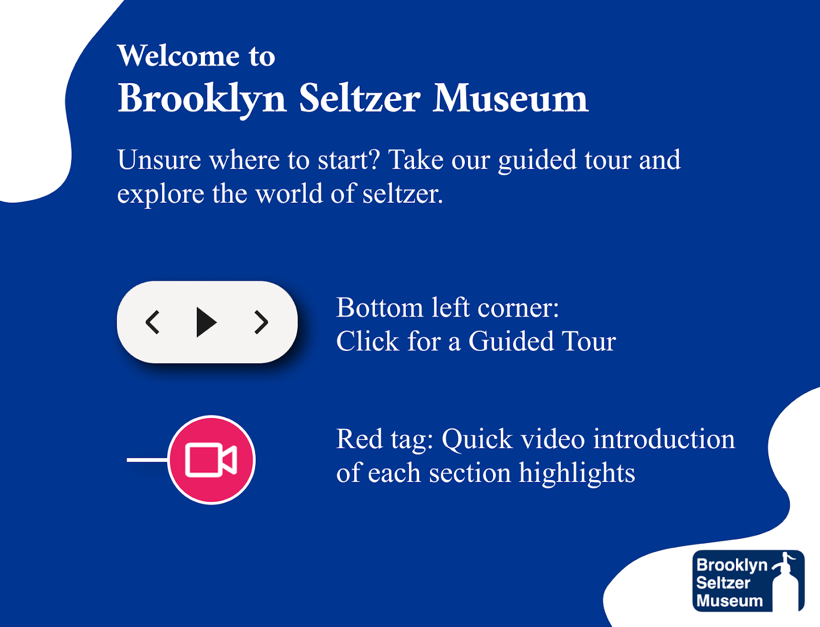
Step 1: Efficient Onboarding Sets the Stage for a Clear Direction
One of the key insights from our user study is the importance of a well-structured onboarding experience is to help users navigate through the virtual tour. We’ve decided to add:
- A welcome message to engage visitors.
- A clear instructions on navigating Matterport.
- An overview of the museum’s sections with a simple sketch.
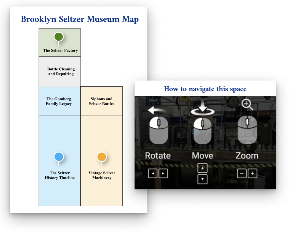
Onboarding Instructions and Introduction Text, Including Navigation Guidelines, a Map, and a Legend, 2024
Step 2: Offer Skim, Swim, and Dive Paths for all seltzer knowledge levels
To accommodate users of all varying levels of interest about seltzer, we structured the tour into three paths. These are three distinct engagement paths: Skim, Swim, and Dive. This ensures that visitors can engage with the museum at their desired depth. For Skimmers, a 2-minute guided tour covering key highlight exhibits, Swimmers, a 3-4 minute video highlight of each section’s themes, and Divers who want more information with the ability to click for detailed posters and webpages of interest.
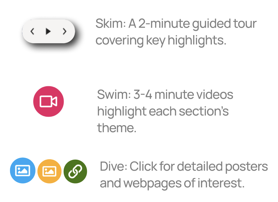
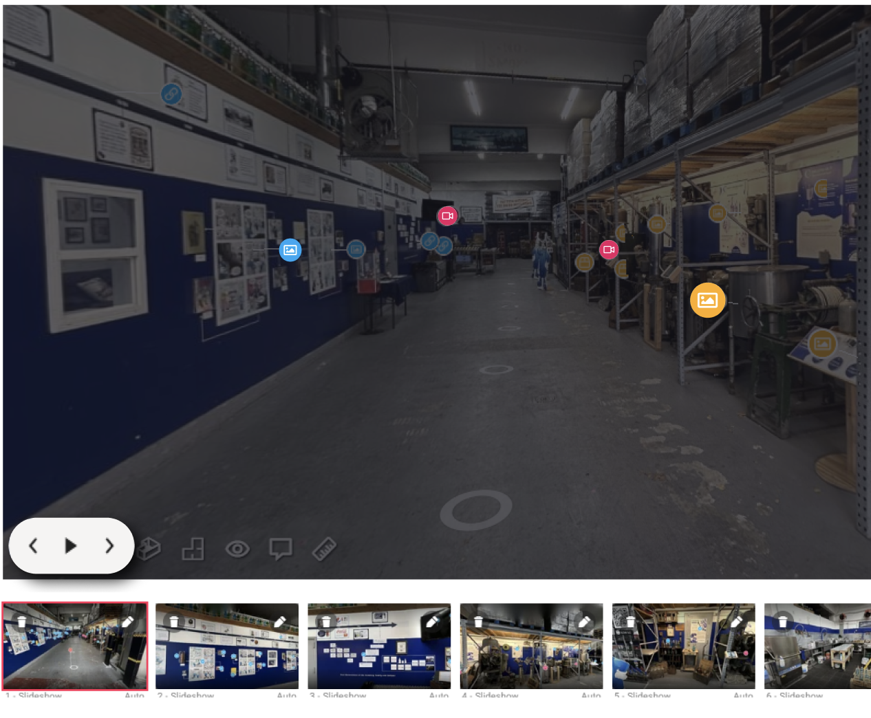 Guided Tour Highlights for Key Exhibits with Highlighted and Color-Coded Tags, 2024
Step 3: Recommended New Content: Craft Content Recommendation
Based on the contextual inquiries and interviews, visitors expressed a desire for features that would deepen their engagement with the museum. To address this, we recommended content that highlights how the Gomberg family preserves the heritage of seltzer-making. This includes showcasing the maintenance of vintage machines, the reuse of bottles, and the careful operation of the factory—all of which ensure that the tradition and taste of seltzer remain alive today. These recommendations were incorporated into the guided tour as part of its video highlights, enhancing the storytelling and providing a richer visitor experience.

Crafting Principles for a Virtual Experience
Our process is guided by three principles:
✔️Preserving Authenticity: by reflecting on the Gomberg and Seltzer history and artifacts
✔️Simplifying Navigation: by creating the most intuitive route
✔️Engaging All Audiences: by creating a generalized tour that caters to both casual visitors and seltzer aficionados
Uncovering Visitor Expectations
After immersing ourselves in a couple of their guided tours, we interviewed a few visitors, as well as remote users to understand their experience. Through our observational studies and contextual inquiries, we have identified what draws visitors to the museum and how a virtual format could amplify especially those who are virtual.
Crafting a Guided Tour: Accessibility Meets Narrative
One of the major key insights from our user study was the strong desire for a cohesive narrative to guide the virtual tour, just like the one in-person. Visitors expressed that a well structured story would help them connect emotionally with the historical and familial aspect of the museum.
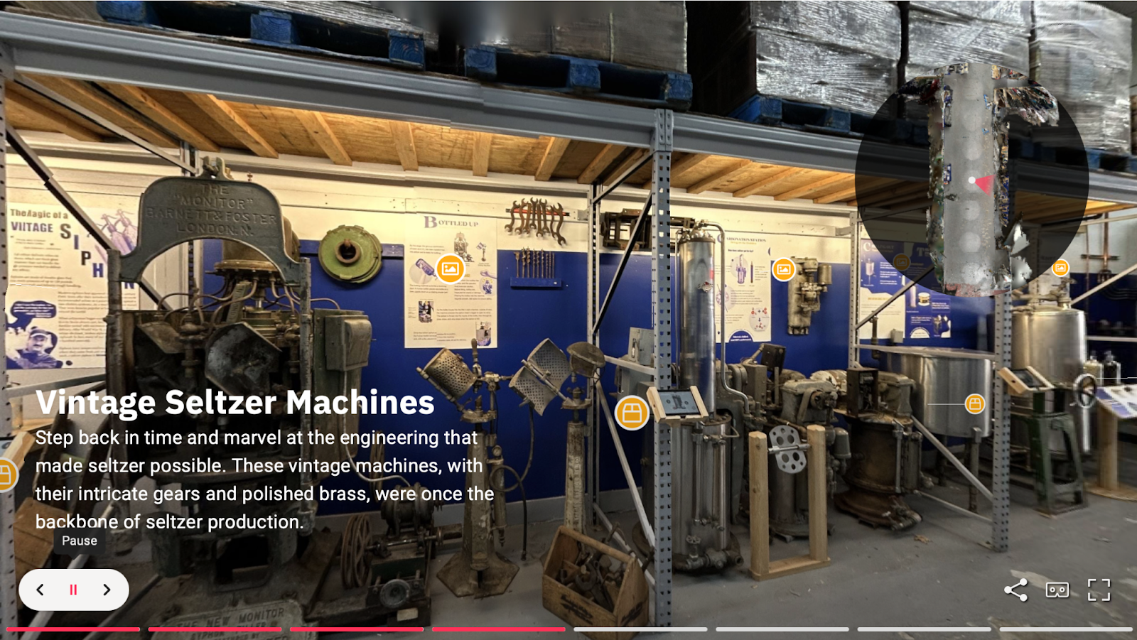
Final Screenshot of the Matterport Guided Tour Interface, 2024
The in-person tour script provided a natural structure for the virtual tour. It highlighted the key themes and exhibits that resonated with the visitors, especially the fascinating WWII origin of the liquid CO2 tank that formed the backbone of the narrative. These elements not only gave context to the exhibits but also an emotional connection that drew users deeper into the experience. Although there are things that are not replicable digitally like the Egg Cream – a chocolate seltzer drink-making experience, we tried our best to capture the essence of these moments through the guided tour.
Building a Foundation for the Virtual Experience
Before diving into the design and development, we conducted a content audit to identify, evaluate and organize the museum’s existing materials. This was critical to understanding the flow of the tour, as well as meeting the museum’s goals and objectives of creating an intuitive and engaging experience.
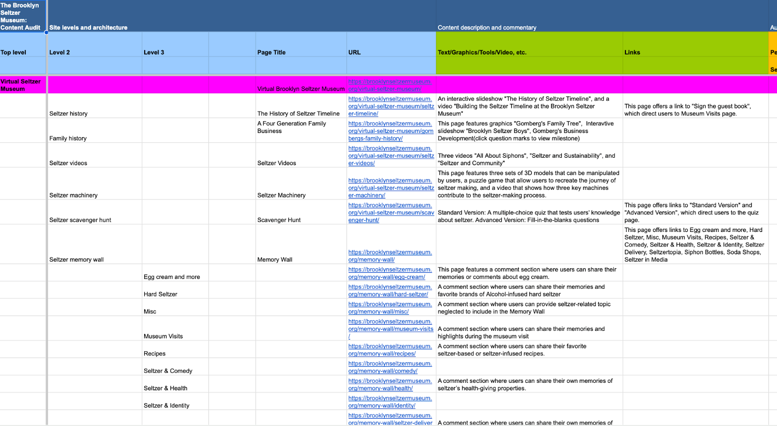
Content Audit of Assets from the Current Website, 2024
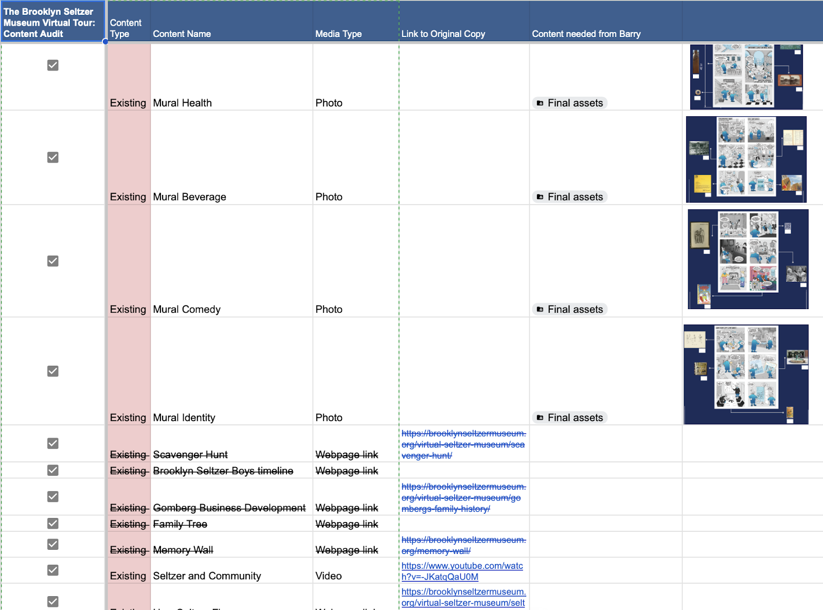
Content Audit of Proposed Assets for the Virtual Tour, 2024 (step-3 in the 3 step tour)
We began by cataloging the museum’s both virtual and in-person, current assets of artifacts, 3D models, multimedia files and existing web content. This process allowed us to understand what resources were available and gaps should be filled. For the virtual content especially, this allowed us to avoid repetition in the tour.
Once cataloged, each piece was assessed for its relevance and adaptability to the virtual format. Based on the tour guide script, we also created a skeleton plan of the contents and chronology of the tour.
EXECUTION
Initial Design
After meeting with our client during our midpoint presentation, we executed a 360 Matterport tour capture. We enhanced navigation, storytelling and user engagement by structuring our tour with our three guiding principles of preserving authenticity, simplifying navigation and engaging all audiences.
Initial Monochromatic Blue Tags Resulted in Visual Clutter, 2024
From Two Points to a Single Standpoint
During the recording process, we discovered that placing two parallel standpoints in the entrance hallway created significant challenges.Matterport’s technology captures 3D scans by stitching together data from each standpoint, but the close proximity of these points causes overlapping scan data, resulting in blurred visuals and a disjointed experience.
Initially, we followed Matterport’s guidance, assuming more standpoints would enhance clarity, but the narrowness of the hallway amplified these issues.
To address this, we consolidated the two points into a single, centrally aligned standpoint. This adjustment not only resolved the visual clutter but also improved the flow of the virtual tour, ensuring a clearer and more intuitive user experience.
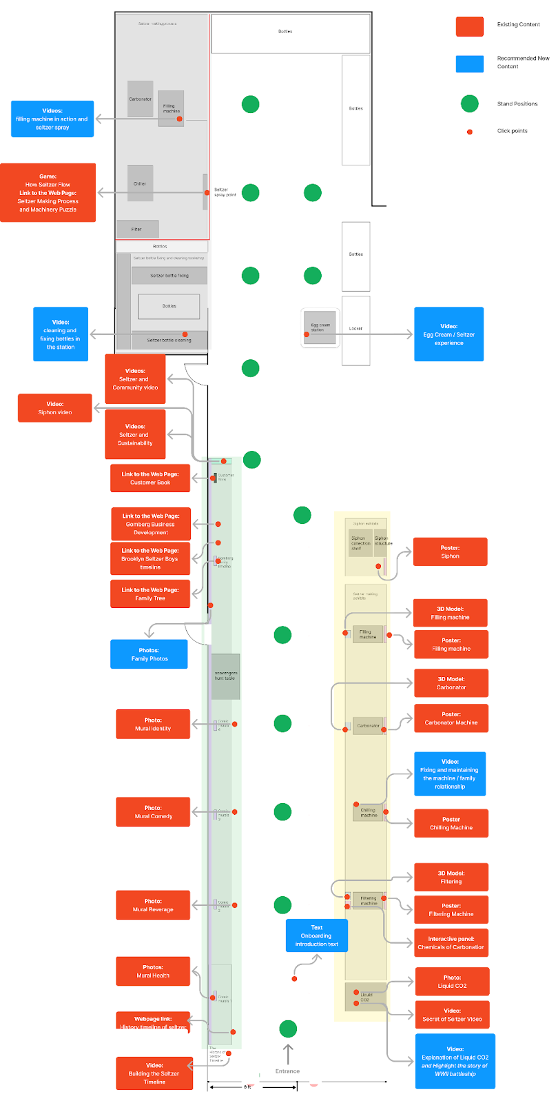 Updated and Finalized Blueprint of a Singular Linear Standpoint Layout, 2024
DESIGN ITERATION
We then conducted Usability Testing and found Visual Clutter in our initial design.
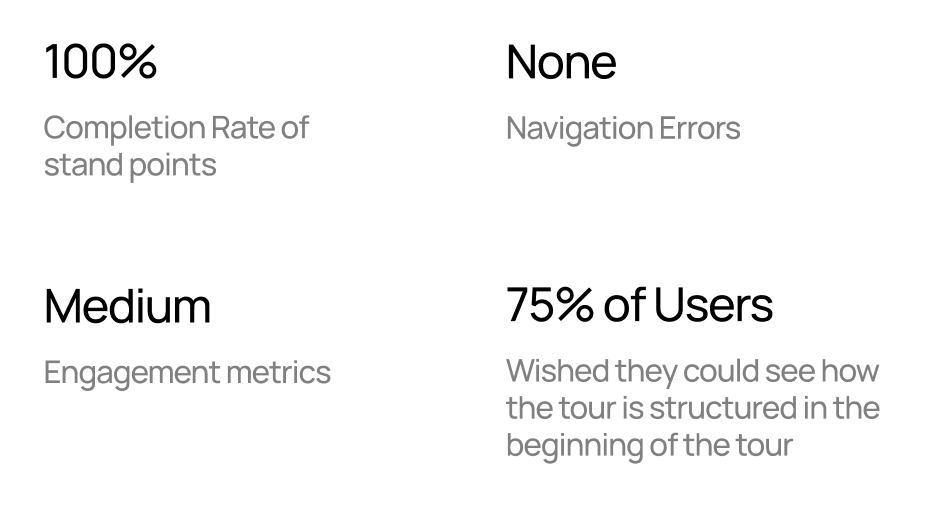
We tested the first design with 4 users. They all navigated the space, found directions, and explored all points. However, they struggled with content order and lacked a way to skim.
As we moved to the execution phase, we faced the challenge of balancing visual clarity and user navigation in a relatively compact space. We initially planned two standpoints in the front area of the museum to provide multiple perspectives and highlight various artifacts. However, during testing, it became apparent that this approach created more problems than it solved.
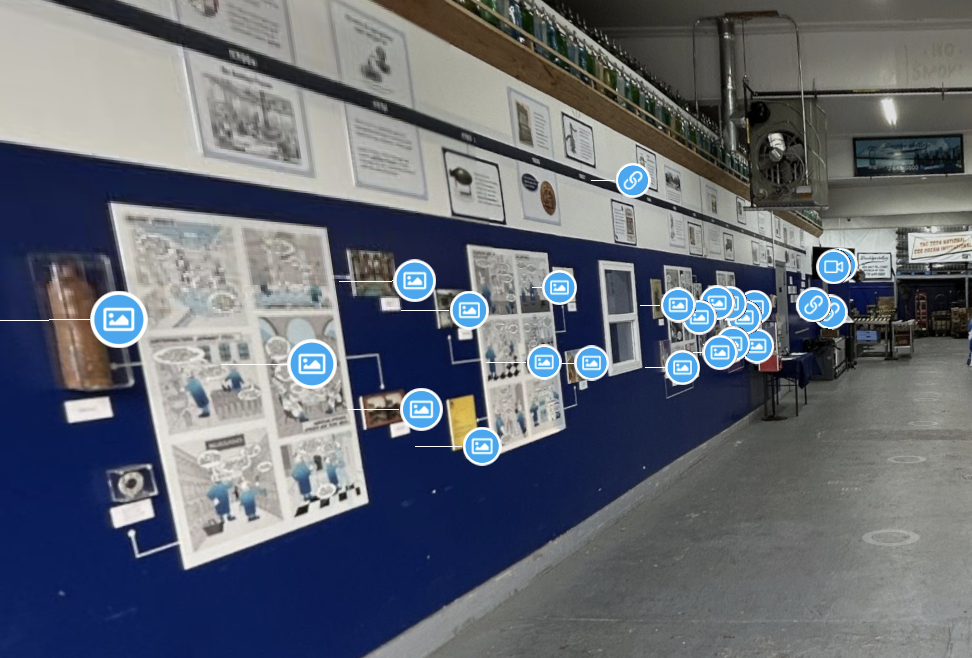
Initial Monochromatic Blue Tags Resulted in Visual Clutter, 2024
The overlapping perspectives added unnecessary visual clutter making it difficult for users to focus on key exhibits, as well as creating blurs in the scans. Overall, it felt cumbersome and disjointed, breaking the intended flow of the tour. Users expressed confusion whether to explore both standpoints, which ultimately detracted from the seamless and intuitive experience we aimed to create.
“Tags are a bit overwhelming for me, I just want to quickly browse through and get the gist of the museum.”
– Visitor
Our goal was to improve the visual clutter by:
- Using color coding to differentiate sections.
- Placing the most important tags in prominent positions.
- Structuring the tour more intuitively
User Reaction
After our implementation, users expressed how much easier it is to navigate around the museum because of the three different approaches of Skim, Swim, and Dive. The flexibility of the various depths of museum engagement proved to be an effective solution that allows visitors to tailor their experience to their own interests and time constraints.
“I loved how the tour let me choose my own pace. The video highlights gave me just enough detail without being overwhelming, and when I wanted more, the guided tour option had everything I needed. It’s such a flexible and engaging way to experience the museum”
– Visitor
In the end, these changes shaped a seamless and engaging virtual tour.
We’ve successfully created a virtual tour for the Brooklyn Seltzer Museum that is immersive, and engaging, and ensures that all interest levels of each visitor are met using our three-step solution.
Before and after Matterport Tour Screenshot with Updated Improvements, 2024
Takeaways
We learned that designing with the virtual user in mind is essential. Our work on the Brooklyn Seltzer’s Museum’s virtual tour underscored the importance of user-centered design and adaptability. Matterport’s limitations and the museum’s compact space posed additional challenges but creative problem solving allowed us to deliver features like grouped tags, and guided narratives inspired by the in-person script.
By basing our storytelling on the in-person tour, we created emotional connections and stayed authentic to the museum’s voice. Iterative testing, especially around scan placements, tag designs, and navigation, was invaluable. Each round of feedback helped us refine and simplify the virtual tour, making it more intuitive and enjoyable.
Organizing content into thematic groups and reducing visual clutter made navigation straightforward and approachable. Accessibility also played a big role—adding captions, audio guides, and visual cues ensured that users of all abilities could engage fully. Interactive features like 3D models and videos transformed static exhibits into dynamic experiences, creating a sense of depth and immersion.

